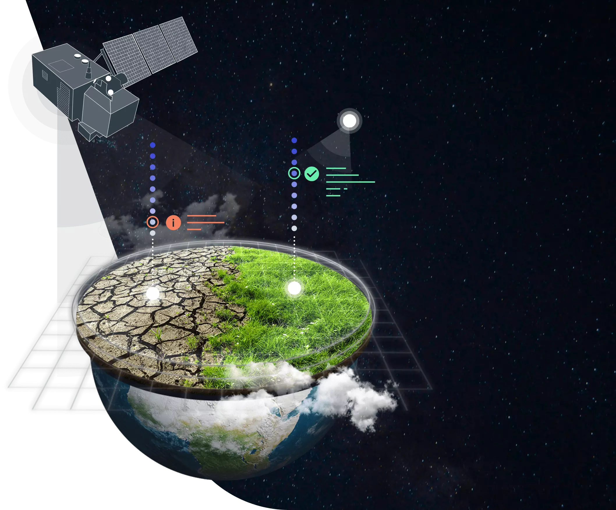
What is the Pale Blue Dot Challenge?
The Pale Blue Dot Challenge is a Nasa and Driven Data competition with the purpose to leverage open science and to make Earth observation data available to all.
The goal of the Pale Blue Dot Challenge
The goal for the challenge is to create a visualization using Earth observation data that advances at least one of the following Sustainable Development Goals (SDGs): Zero Hunger, Clean Water and Sanitation, Climate Action
Sustainable Development Goals (SDGs)


About our project
Our group chose to create a visualization through a dashboard and map with the Extreme Heat related data. Our goal is to relate factors like surface and air temperature and humidity.

Data fonts used in this project
The main data font used in this project is the Giovanni system from NASA, wich gathers geophysical data from many satellites and space probes, like AIRS and Landsat. Furthermore, the Google Earth Engine API was used to generate maps with data about climate actions and its consequences, like indexes of vegetation and soil moisture.

Tools used in this project
The main tool used to build the dashboard for this project is the Python programming language. In addition to this, tools like the Pandas library for data analysis and Plotly for creating graphs.
How to make use of this dashboard
This dashboard contains data about the main extreme heat's factors and actions through the latest years. With it, you can gather information about human action relates to temperature problems and abnormalities and determine its causes and consequences.
How to access the source code of this project
The source code for this dashboard and all the data used is in this Github repository.